Friday, December 2, 2011

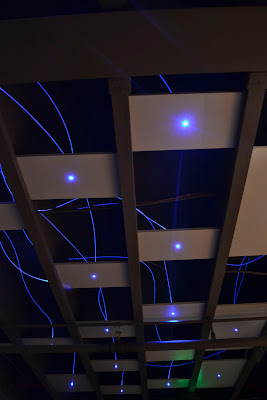
 These are the pictures from the assignment at the Paramount and Jefferson theaters. To the left, right, and directly below are my three favourite shots.

 Above: Jeferson Theater bar, Below: Paramount Theater in the main theater with photography students,

Directly below:  Poster advertisement of Rock Paper Scissors, Bottom: T-shirt design for Rock paper scissors.

Thursday, November 10, 2011

Warm Colors

 Warm colors are colors that seem warm to the eyes. Examples of these colors are red, yellow, orange, and mixes of the three. I emphasized the colors in my photographs by adding warm tint, extra contrast, and pulling up the vibrance.


Words and Brushes

 I downloaded the brushes from several sites, whose links I will put here later.

Watermark


A watermark is a mark that photographers use to mark their photos to either protect the photos, or just as a protective mark to show that the photo belongs to somebody. I made mine by lining up letters one over another, and was pleased to find that they lined up well.

Friday, October 28, 2011

Elements of Art and Principles of Design - Carter Mountain

 
 For the most part, I used the adjustment brush just to highlight the elements and principles I was trying to show in the pictire


.

Spooky Image

The tutorial I did was the spooky image tutorial where you replaced part of the person's face with a skull, and yes, it was easier this year because of my extended knowledge of photoshop tools and how to use them.

Create Your Own Project

I chose this project because although a little challenging, it wasn't too far over my head, and I really enjoyed the way it looked. I like the technique used, and hope to use it in the future.

Monday, October 17, 2011

Explore Photography

 From the list I was provided, 5 of the categories of photography I liked were:
 Top: Animals/pets
 Second: Nature
 Third: Black & White
 Fourth: Composition
 Fifth: Stock (Texture)


9/11 Comemoration

I believe we worked really well as a class on this project. It has a touch of each person's style, but not in overly obvious ways, and the mix of minds made for a smooth image with a clear subject. I really liked how we all worked on it, and would possibly like to do something similar in the future.

Balance Collages


The three Balance collages I did were Symmetrical inspirations (top left), asymmetrical about me (bottom left) and circular advertisement, (right). 

Image Review

Using a mix of images, we were assigned to make a collage and use 10 images. I wasn't too challenged, I remembered most of my tools well and even used some in ways I hadn't before. The review was helpful, though, and gave some extra practice.